CASE STUDY

Souvenir
Souvenir is a social journaling app that helps close friends capture meaningful moments and reflect on them together, honestly.
View on Devpost ↗
People want to hold onto meaningful moments, but consistently documenting them is hard.
Journaling asks for time and discipline most people don't have. At the same time, social media platforms have become centered around curated content over authentic reflection.
Souvenir is a social journaling app built to encourage original thought and meaningful reflection among close friends. My teammates and I designed it during Rice University's annual designathon and were selected as a Top 8 finalist out of 150+ teams.
DESIGNATHON PROMPT
“Fostering Connection in the Age of AI”
01 — The problem
Reflection kept losing to friction and performance
Research surfaced a consistent tension between wanting to reflect and the tools available to do it.
Consistency is hard to sustain
People want to journal more often, but few keep the habit long-term.
Journaling feels time-consuming
Traditional journaling asks for more effort than most people can consistently give.
Social media feels performative
Existing platforms reward curated highlights over honest, unfiltered reflection.
AI raises questions of authorship
As AI writing tools spread, people worry about what's left of their own voice.
02 — Research
Talking to people about how they actually reflect
With 48 hours on the clock, we moved fast without skipping the fundamentals.
- 8 user interviews
- 30+ survey responses
- Secondary research on AI and creativity
8
1:1 user interviews conducted
30+
survey responses collected
03 — Design decisions
What makes Souvenir different
Every decision traced back to lowering friction without lowering authenticity.
Conquering the Blank Page
THE PROBLEM
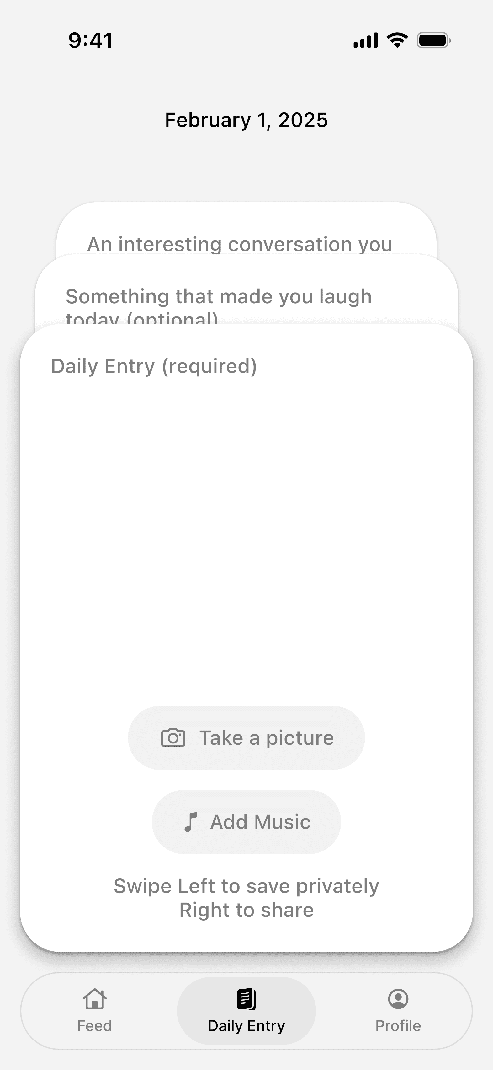
A blank page is the single biggest reason journaling habits don't stick. Opening the app to an empty text field asks for more time and self-direction than most people have left at the end of a day. so the entry never gets written.
THE SOLUTION
We replaced the blank entry with a stack of lightweight prompt cards withquick, specific questions like “an interesting conversation you had” or “something that made you laugh today.” Swiping through a prompt feels closer to answering a text from a friend than filling out a form, which lowers energy to just start writing.
Interactive, Not Generative
THE PROBLEM
AI writing tools can fill a journal entry in seconds, but if an algorithm writes your reflection for you, it stops being your memory. We wanted Souvenir to support an authentic voice, not replace it.
THE SOLUTION
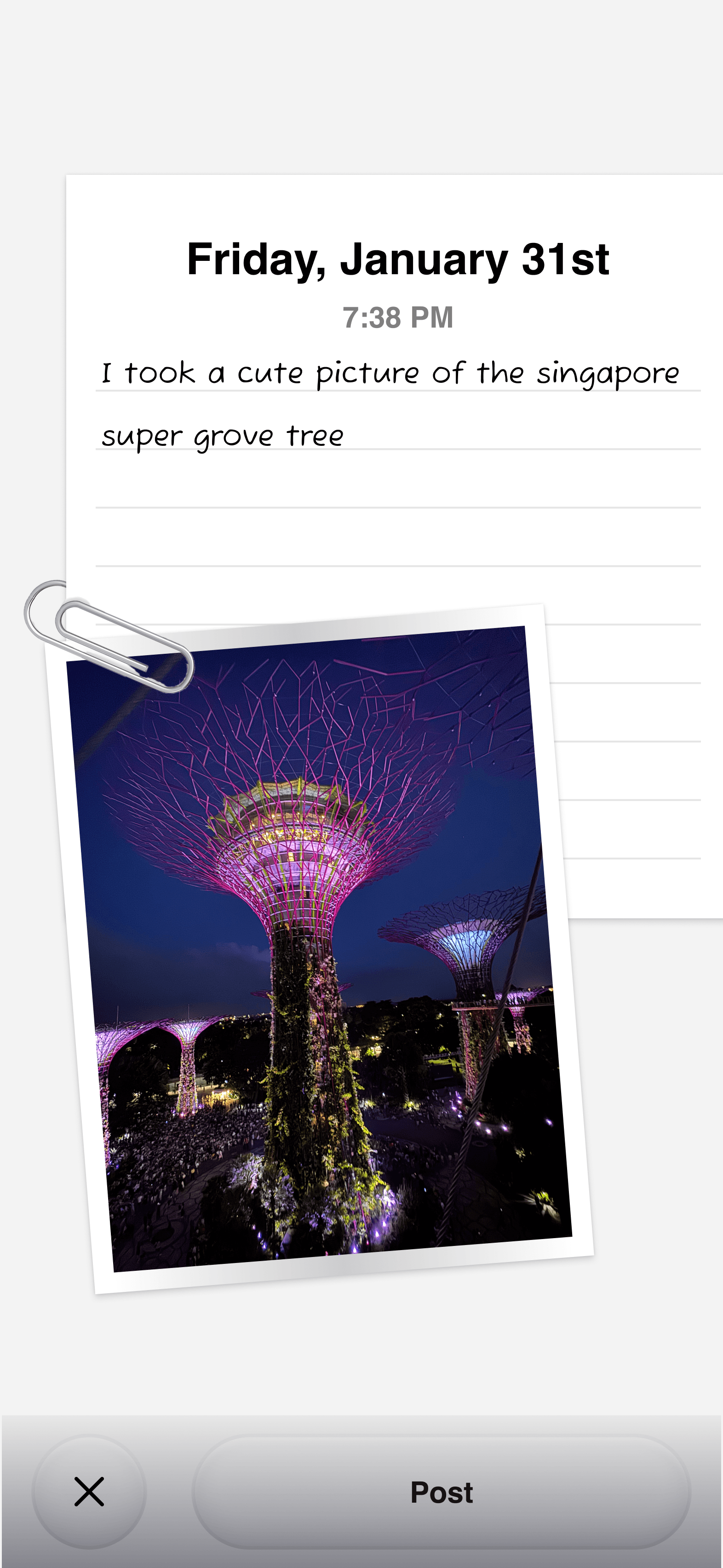
So we drew a firm line. No AI-generated journal text. Instead, entries can be personal with a photo from the day or a song stuck in someone's head, letting the app add texture to a memory without ever speaking for the person writing it.
A Look with Personality
THE PROBLEM
Most journaling apps default to a clean, minimal interface that, while polished, feels emotionally flat.
THE SOLUTION
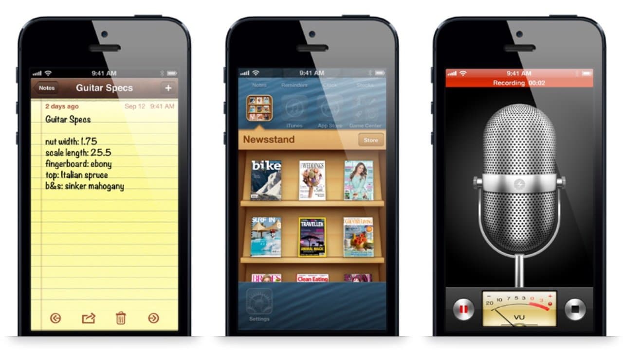
We leaned into skeuomorphism instead, drawing from the tactile, nostalgic interfaces of early iOS — lined notepads, paper textures, tape and paperclips — so opening Souvenir feels like filling in a physical scrapbook.
04 — Prototype
Final Prototype
A walkthrough of Souvenir's key features.
Making a Post
Capture a moment in a few taps. Add a photo, drop in a song, and jot it down before the feeling fades. The flow is lightweight, so posting never competes with actually living the moment.
Looking Back at Memories (Profile)
Past entries live on a personal profile that reads like a running scrapbook rather than a feed to scroll past. Revisiting old posts is designed to feel like flipping through a photo album, encouraging reflection, not just more scrolling.
Prompt Cards
A stack of swipeable prompts replaces the blank page, turning journaling into answering a quick question instead of writing an essay. Each swipe surfaces a new, specific prompt, keeping the barrier to entry low even on busy days.
Weekly Recap
At the end of each week, Souvenir surfaces a summary of that week's entries, giving people a moment to notice patterns instead of just accumulating posts. It's designed as a gentle nudge back into the app, not another feed to keep up with.
Reflection
My first-ever designathon.
Beyond the final product, my biggest takeaway was learning to design under constraints while giving myself permission to experiment. Excited for many more design-a-thons to come!
Keep exploring